_edited.jpg)
Project Overview
Role: UX/UI designer
Methods: Ideation, UX Research, Interviews, Sketching, Information Architecture, Workflows, Wireframing, Accessibility Design, UI Design, Low- and High-Fidelity Prototyping
Duration: 5 days
Tools: Figma, Miro, Marvel
About
The Challenge:
While SAVR Recipes is praised for the quality and flavour of its dishes, many users struggle with the more complex recipes. Instructions can feel unclear, the timing and order of steps are sometimes inconvenient, and some recipes require cooking techniques that users aren’t comfortable with. This leads to frustration in the kitchen and negative reviews, diminishing the overall user experience.
The Solution:
Run a design sprint (inspired by the Google Ventures model) to rethink the recipe-following experience from start to finish. The goal is to create a process that makes instructions more intuitive, steps easier to execute, and techniques approachable. By optimizing clarity, timing, and usability, SAVR can empower users to cook with confidence, turning what was once frustrating into an enjoyable and seamless cooking journey.
The Sprint process:

Day 1: Understand & Map
The user research shared with me revealed that while home cooks love SAVR Recipes for the quality of its dishes, many leave the experience frustrated when attempting the more complex recipes. Traditional methods of guiding users, like step-by-step written instructions often fell short. They weren’t always clear, convenient, or easy to execute, especially when timing, sequence, or advanced techniques were involved.
In this scenario, Savr brought me on board to support their long-term goal: building a more intuitive recipe experience that helps users cook confidently at home.
From this, I defined my sprint question: How might we improve how users experience cooking while following a recipe in real time?
Understanding the Problem
To begin, I reviewed highlights from the user research along with persona information. This persona represented the target home cook we would focus on throughout the sprint.
Persona

Research Highlights
SAVR Recipes shared user reviews that showed common problems and what users expect from the app. I looked through this feedback to find patterns and understand their main frustrations.
From this, I summarized key insights that can guide design improvements, making the app easier to use and more enjoyable for users.

User Journey Map
This journey map illustrates how SAVR Recipes supports users through every stage of cooking; from landing on the homepage, reviewing ingredients and utensils, prepping efficiently, following step-by-step instructions via videos, notes, or voice commands, to finishing with serving tips and plating ideas enhanced with photos.
It highlights user needs for clarity, convenience, and guidance at each stage to make cooking seamless and enjoyable.

Day 2: Sketch your solution
Lightning Demos
For the Lightning Demo step, I explored existing cooking apps to gather inspiration for SAVR Recipes. I focused on SideChef and Tasty, analyzing their unique features and what makes them effective.


Tasty
Inspiration: Short step-by-step video recipes, very visual and easy to follow.
What to take away: Visual storytelling + minimal text helps reduce confusion.
SideChef
Inspiration: Voice-guided step-by-step instructions.
What to take away: Hands-free cooking experience reduces the need to keep checking your phone.

Crazy 8 Summary
For the Crazy 8s, I sketched eight rapid ideas exploring how users move through the SAVR cooking journey: logging in to access recipes, viewing ingredients and utensils upfront, following clear prep steps, cooking with flexible support (videos, notes, or voice commands), and finishing with serving inspiration through tips and photos.
Each sketch tested different layouts and interactions to discover creative ways of making the process more engaging & seamless.
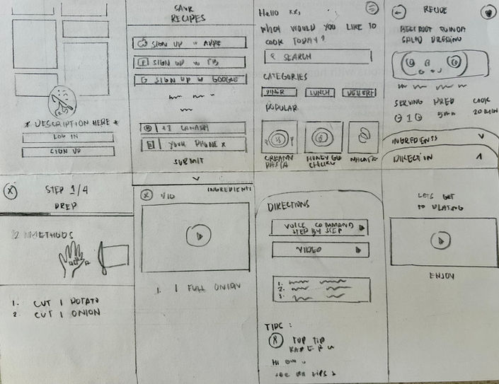
Solution Sketch – 3-Panel Board
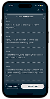
After identifying the most important features for SAVR, I created solution sketches focused on a seamless cooking flow. The critical screens are Choosing a Recipe, Preparation, and the Step-by-Step Tutorial, which supports both video guidance and voice commands for hands-free navigation.
These screens were prioritized to address key user pain points, such as decision-making, ingredient readiness, and ease of following instructions. I also explored alternate sketches to refine these screens and enhance overall usability.
Choosing a recipe
Preparation
Hands free navigation

Day 3: Decide & create a storyboard
User Journey Storyboard
Creating the storyboard for SAVR helped me visualize the user’s end-to-end cooking journey in a clear and relatable way.
By mapping out each panel; login, recipe selection, preparation, tutorial, cooking, and serving. I was able to see how the app supports users at every stage. This exercise revealed key opportunities to enhance usability, such as making recipe choice intuitive, simplifying preparation steps, and offering flexible support during cooking through videos, notes, or voice commands.
The storyboard also highlighted the emotional side of the experience;turning cooking from a potentially stressful task into an engaging and guided process that ends with confidence in presentation. Overall, the storyboard clarified which screens and features are most critical to the user experience and guided the next steps for refining the design.

Day 4: Prototype
This prototype was designed to highlight the essential flow of a cooking app while keeping the scope focused and manageable. Instead of building out every possible path, I limited the journey to a single recipe in order to clearly demonstrate the main interactions.
The user path includes:
-
Entering through a welcome and login screen
-
Browsing the home screen with curated categories and “recipes of the week”
-
Selecting a featured recipe
-
Moving through step-by-step guidance (via text, voice command, and video)
-
Exploring plating ideas and serving suggestions at the end

Food photography plays a central role, and the images are intentionally large, bright, and colorful to inspire users. Each recipe card and step-by-step screen is anchored by visuals so the experience feels inviting rather than text-heavy.
The overall layout is kept clean and linear. Users are never overloaded with choices.. instead, they move step by step, with clear divisions between ingredients, preparation, and cooking instructions. This mirrors the natural rhythm of cooking and reduces friction in the process.
Typography and spacing are designed for readability. Instructions are broken into smaller chunks, paired with media options (voice or video) so users can choose the guidance style that best supports them while cooking hands-on.
The plating tips at the end serve both a functional and emotional purpose. They give practical advice while also elevating the cooking experience, reinforcing the idea that the app is not just about following recipes but about creating something that looks impressive and enjoyable to share.
View the prototype here.
Day 5: Test
On the final day of the sprint, I conducted usability testing to evaluate how people interacted with the prototype. The goal was to see whether users could move smoothly from discovering a recipe to completing it with the guidance options provided (text, voice, video, plating).
What I Observed
-
Several participants hesitated when switching between instructions, voice, and video. They weren’t sure if these were replacements for the recipe steps or just supportive features. This created a moment of confusion in the flow.
-
The recipe instructions, while accurate, appeared visually dense. On mobile screens, a couple of users mentioned it was difficult to keep their place while reading.
-
A recurring expectation was the ability to adjust serving sizes. Participants wanted to scale the recipe up or down and have ingredient quantities update automatically.
-
Nutrition details also came up. Testers expected to see calories and other nutritional information integrated with the recipe.
-
While browsing, users instinctively tried to swipe through the carousels and tap on recipe thumbnails that weren’t interactive. This highlighted the need for stronger affordances and more complete wiring in the prototype.
-
The plating suggestions, although appreciated once noticed, were often overlooked until the very end.
Insights and Next Steps
The testing validated that the prototype delivered an engaging visual experience and that the dark theme with orange accents created clarity around important actions. However, the feedback also emphasized the importance of:
-
Making navigation between guidance modes more explicit
-
Structuring recipe steps into smaller, scannable chunks
-
Allowing flexibility with serving sizes and adding nutrition facts
-
Building more interactivity into carousels and recipe cards
-
Surfacing plating tips earlier so they enhance, rather than conclude, the journey
Reflection
Running this sprint showed how quickly small design choices can either support or interrupt the cooking experience. Participants gravitated toward features that made them feel in control (adjustable servings, video guidance) and grew frustrated when expected behaviors (swiping, tapping, video playback) didn’t work in the prototype. These findings will directly shape the next iteration, where the focus will be on refining clarity, interactivity, and customization.